The Difference Between Data Analytics and Data Visualization
Successful data-driven businesses collect as much useful data as possible — from customer feedback, website clicks, and even social media campaigns — and empirically analyze it to inform their decision-making processes. Data analytics is the part of this process that extracts meaning from this data.
Data visualization can then be applied to this meaningful data, helping to effectively convey the insights found in it, in the form of easy-to-understand visual narratives that can be shared internally and with external stakeholders.
This article explores the differences between data analytics and data visualization, and it explains the primary data visualization strategies you should use and how they benefit your business.
What is data analytics?
Data analytics is the field that encompasses the collecting, cleaning, formatting, and modeling of data. The goal of data analytics is to uncover practical and usable insights that are pertinent to the decision-making process in a business. Data analytics is implemented to make sense of your data assets and ensure their value is fully realized.
Common examples of the use of data analytics in business include:
- Descriptive analytics: This analyzes data to answer questions of the form “what happened?” or ”what is happening?” — for example, “Did sales drop?” “Did we see an increase in users signing up to the platform?”
- Diagnostic analytics: Diagnostic analytics follows on from descriptive analytics, asking ”why did it happen?” — for example, “Why did sales drop?” “Why didn't we see an increase in users?”
- Predictive analytics: Predictive analytics takes historical data and uses it to predict what will happen, should existing trends continue — for example, “What are the forecast sales for December?” “Will we continue to see an increase in user signups next year?”
- Prescriptive analytics: Patterns in past data can also inform decisions so that you can attempt to make things happen, and potentially break from existing trends. For example, knowing when traffic is at its peak can answer questions like “When should we launch our new product?” or “When is the best time to have a sale?”
Depending on your requirements (and available resources), data analytics can go far beyond simple data analysis. It can include things like automatic regular reports that answer recurring questions or intelligence summaries that flag potential areas of action for stakeholders.
What about data analysis?
The term ”data analysis” is often used synonymously with “data analytics.” This is not entirely accurate — analysis is part of the analytics process. Data analytics is the overall practice encompassing all of the tools, strategies, and procedures you implement to enhance and understand your data, whereas analysis is the specific action of analyzing data.
What is data visualization? How is it used?
Data visualization is the process of converting data to a format that can be visualized and then building that visual representation. It takes complex or large datasets and presents them graphically so that the story behind them can be better understood.
Business use cases for data visualization include:
- Correlating data: Graphs can be used to represent increasing and decreasing sales over time, and are especially useful when correlating two different datasets. For example, placing a sales graph next to a graph of website performance might correlate a drop in sales to website outages, suggesting (not proving) a causal link.
- Charting performance: Charts and graphs are appropriate for visualizing the positive or negative impact of a decision — for example, the relative popularity of a new product category can be visualized using a pie chart, or the effectiveness of marketing campaigns can be graphed and assessed.
- Visual explorations: It can be easier to spot unexpected patterns or anomalies in visualized data than in tabulated data spread across different datasets. As these are unexpected, it is not possible to begin the analytics process with an established hypothesis about them. A visual exploration aims to present as much data as possible in a graphical format so that analysts can identify these unexpected patterns more effectively.
- Advanced, multi-faceted visualizations: Visualizations that combine multiple variables, or add additional precedence information, can communicate a story with more than one contributing factor. For example, funnel graphs can communicate the effectiveness of multi-stage processes (see the marketing funnel), and cohort analyses can be used to convey and correlate user retention and churn.
Data visualization is key to communicating the meaning behind data to stakeholders throughout your organization, especially to those who may not be familiar with it.
Data analytics vs. data visualization
Data visualization is not an alternative to data analytics — it’s a way of presenting and communicating data collected and verified by the analytics process. It should be considered one of the final stages of the analytics process or as a subsequent task that relies on analytics.
Data visualization may be performed by data analysts, or by graphic designers and content creators working with the analysts' data. Because of this, it’s important that the data is properly vetted and curated prior to visualization to ensure that the visualizations are created accurately by those who may not be familiar with the intention or processes behind the data.
Data visualization techniques
Data can be presented visually in any number of ways. Several standardized methods have emerged (both through mathematics as a discipline, and specific to analytics applications) that accurately and effectively convey the trends, patterns, and outliers that tell the story of your data.
The most effective (and therefore most common) data visualization techniques you will find and use in business include:
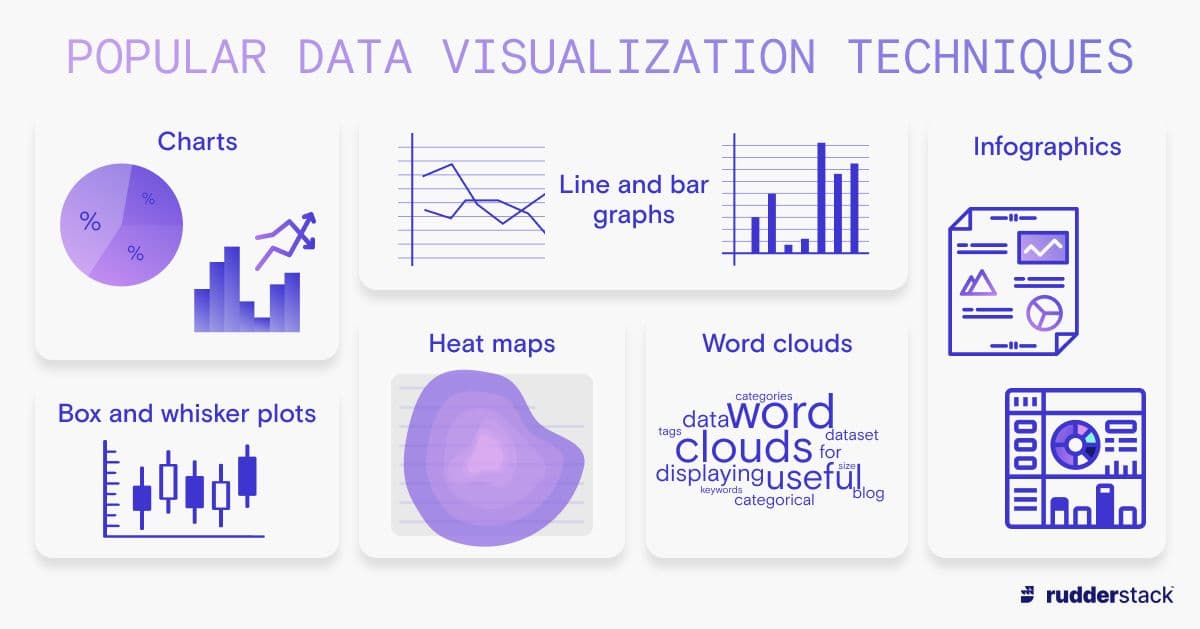
- Graphs and charts: Graphs are the most prolific data visualization device. Bar/line graphs show the movements of numerical values over time or their magnitude in relation to each other, which is highly beneficial when analyzing and correlating multiple datasets. Pie charts can quickly communicate proportional values.
- Heat maps: Heat maps use color gradients to signify magnitude and are often overlaid on other visual data to correlate these values with a location, or to add other meaning. For example, temperature heat maps will overlay cooler/warmer colors over geographical data (in the form of maps) to communicate where the temperature is hotter or colder, or a heat map could be overlaid on a basketball court to show where goals are most often scored from.
- Box plots / box and whisker plots: Box and whisker plots can show whether data is skewed and help identify potential outliers. They provide a visual summary of data by visually displaying the median and quartiles and the spread between them.
- Word clouds: Word clouds are useful for displaying categorical data. Showing all of the words in a dataset — for example, blog categories or tags, or searched keywords — with the most frequently occurring ones in a larger size establishes a clear visual narrative about the popularity or importance of each term.
Infographics: Infographics are a combination of other data visualization techniques, and are highly variable in their appearance. They present data in a way appropriate for the type of data, the way it was collected, and its meaning. This can mean variations in color, use of icons and illustrations, arrows and flow indicators, and the use of size to indicate magnitude and ordering to indicate precedence. Infographics can be used to break down your data, the concepts behind it, and the lessons from it, making it easily accessible and shareable.
Common data visualization techniques in data analytics.
This list is not exhaustive, because you can visualize your data however you want. The data your business collects is highly unique, so you may have a way of communicating it visually that is also unique.
Combining and adapting existing techniques and even other visual communication methods, like photography to provide visual metaphor, can help you convey the meaning behind data.
Why use data visualization? What are the benefits?
Humans communicate visually, and many people are visual learners who are best able to absorb new information when it is presented to them graphically. A table with multiple columns and thousands of rows of data is meaningless to most at a glance — but a graph of the same data can be easily understood and discussed. Different graphical representations, shapes, and colors can differentiate, clarify, and frame the meaning behind data so it can be more easily understood and remembered.
Visualizing data makes it more accessible to those outside of the specific domain of knowledge the data may cover. Visualizations make data more readable and allow for the input of a more diverse group for better insights. Graphical data is also easier to share, and because it can be understood more quickly (often at just a glance), it can assist in driving consensus among stakeholders faster, enabling more streamlined decision-making.
Data visualization can also help in exploratory data analysis as well as descriptive and diagnostic analytics processes. For example, the ability to chart different events in scatter plots can be useful when trying to find (or disprove) correlations between them.
A robust data analytics process that includes data visualization will enable your company to focus on the data’s meaning and real-world implications, rather than getting stuck trying to understand the raw numbers. It can also benefit individual team members, providing a powerful tool for communication and persuasion, and helping drive positive change.
Data analytics, data visualization, and customer data platforms
The data your business requires to drive its decision-making processes will come from an ever-growing number of sources. Businesses pivoting to a data-driven approach will be able to collect data from their sales and marketing efforts, financial systems, and other business processes.
Once analyzed, data visualization makes this data easy to consume for cross-functional teams, helping your staff understand the data's story and make data-driven decisions regardless of their familiarity with the analytics process.
A customer data platform (CDP) can assist with both the analytics and the subsequent data visualization process. CDPs streamline the collecting of data from multiple sources, formatting it for consistency, and storing it for future use — all the while ensuring that the data is of high quality and reliability, so that the insights you get from it are, too.
A CDP will connect your data streams to data warehouses, and powerful visualization and business intelligence tools like Mode, Power BI, Sigma, or Tableau for both historical and ongoing analysis.