Blog
Data flow diagram: Components, purpose, and how to create
Data flow diagram: Components, purpose, and how to create

Brooks Patterson
Head of Product Marketing
12 min read
May 5, 2025

Data flow diagrams (DFDs) are visual tools that map how data moves through your systems, from sources to storage to outputs. They help teams align around processes, identify bottlenecks, and support better architecture decisions. DFDs come in layered views (Level 0, 1, 2+) and use consistent components: processes, data stores, external entities, and data flows. When paired with platforms like RudderStack, DFDs shift from static diagrams to living systems. RudderStack simplifies real-time event ingestion, transformation, and routing/ This makes it easier to implement and maintain accurate data flows across your stack.
Complex systems often mask how data actually moves. Information passes through APIs, queues, databases, and tools, but tracking that movement isn’t always straightforward. Even small misalignments between teams or systems can lead to confusion, delays, or inconsistent outputs.
A data flow diagram (DFD) brings clarity by focusing on how data travels, not just where it lives. It captures the connections between sources, processes, and destinations in a way that’s easy to review and easier to maintain. For teams managing modern data infrastructure, this kind of visibility is practical, not optional.
Main takeaways from this article:
- DFDs offer a visual framework for understanding how data moves through a system, supporting clearer communication and better system design.
- The core components of a DFD—processes, data stores, external entities, and data flows—work together to provide a complete picture of system behavior.
- DFDs are organized by levels, starting with high-level Context Diagrams (Level 0) and progressing to more detailed views in Level 1 and Level 2+
- A step-by-step approach to building a DFD, such as identifying data sources, mapping key processes, and labeling data flows, ensures clarity and consistency.
- Platforms like RudderStack help bring your DFD to life by simplifying event data ingestion, transformation, and routing across your stack.
What is a data flow diagram ?
A DFD is a visual tool used to map how data moves through a system—where it comes from, how it's processed, where it’s stored, and where it ultimately goes. It outlines the flow of information between different components such as sources, processes, databases, and outputs. DFDs are valuable for analyzing existing systems, designing new ones, and aligning technical and non-technical stakeholders around how data is handled across an organization.
Types of DFDs
DFDs mainly come in two types:
- Logical DFDs: These diagrams focus on what data is being processed and moved in the system, without emphasizing the specific technology used. They represent the business processes and the data required and produced by those processes.
- Physical DFDs: These diagrams illustrate how the data flow is implemented, including specific hardware, software, files, and personnel involved in the data processing and storage. They provide a more technical perspective on the system and are often used during the design and implementation phases.
It's worth noting that DFDs are distinct from other diagram types commonly used in system analysis. For example:
- Entity-relationship diagrams (ERDs) focus on data entities and their relationships within a database.
- Workflow diagrams outline task sequences and business processes, rather than how data moves.
While each serves a different purpose, DFDs can complement tools like ERDs and workflow diagrams to give teams a more complete understanding of how systems operate and interact with data.
Why use a data flow diagram?
Integrating DFDs into data projects delivers several benefits that enhance understanding and collaboration across teams. These diagrams help technical teams:
- Improve cross-team visibility: DFDs provide a unified view of how data moves through the system, helping teams across engineering, analytics, product, and operations stay aligned. This shared understanding reduces confusion and enables more effective collaboration.
- Identify data bottlenecks or inefficiencies: Visualizing the flow of data makes it easier to spot where delays, redundancies, or errors are likely to occur. Teams can proactively address performance issues or optimize slow processing steps before they impact downstream systems.
- Plan for data quality and governance: By highlighting where data is collected, transformed, or stored, DFDs help teams decide where to place validation checks, monitoring logic, and governance controls. This supports compliance efforts and improves trust in the data.
- Accelerate data onboarding and integration: When introducing new data sources or pipelines, DFDs offer a quick reference for understanding how incoming data will move through your existing stack. This shortens the onboarding process and simplifies integration planning.
- Align teams on data movement: With a visual reference that shows how data flows between systems, teams can make more informed decisions about tool usage, pipeline design, and system dependencies, reducing miscommunication and inconsistent implementation.
Key components of a data flow diagram
A DFD comprises several essential components that form its structure, each representing different elements of the system:
Processes
Shown as circles or rounded rectangles, processes show where data is transformed or acted upon within the system. This can include logic such as validation, enrichment, or sync jobs between tools (e.g., "Transform Event Data," "Sync to CRM").
Data stores
Shown as open-ended rectangles or parallel lines, data stores represent where data is held at rest. This includes systems like relational databases, data lakes, or cloud data warehouses (e.g., "User Profiles," "Sales Database").
External entities
Depicted as rectangles, external entities are systems or users outside the data pipeline that either provide input or consume output. These can include apps, APIs, or third-party tools (e.g., "Mobile App," "Payment Gateway").
Data flows
Illustrated with directional arrows, data flows represent how data moves between components. Each arrow is labeled to describe the type of data in transit (e.g., "Order Info," "User Events"), providing a clear view of system interactions.
Understanding DFD levels
To handle the complexity of large systems, DFDs are often organized into hierarchical levels. Each level offers a deeper layer of detail, helping teams progressively explore how data moves through different parts of the system.
Level 0 (Context diagram)
This context-level diagram provides the highest-level view of the system, depicting it as a single process and showing the external entities that interact with it, along with the major data flows between them and the system.
Level 1
Level 1 expands the single process from the context diagram into its core subprocesses. It introduces internal data stores and shows how each subprocess exchanges data with both external entities and other parts of the system. This level is useful for understanding the system’s main functions and their interactions.
Level 2+
Further levels decompose each subprocess into smaller, more detailed steps. This hierarchical breakdown continues as needed, depending on the complexity of the system and the audience. The goal is to reach a level of detail that clearly documents how each process works without overwhelming the viewer.
Data flow diagram example
To better understand how data flow diagrams function, examine the Level 1 DFD example below.
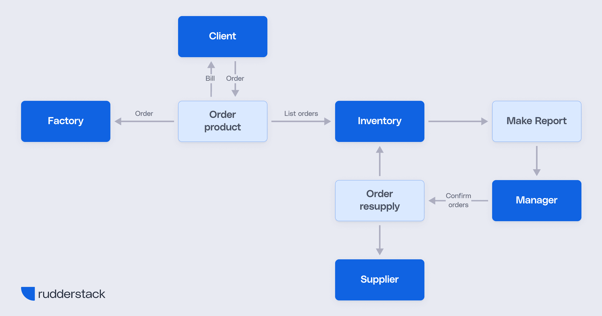
Data flow diagram example
Image source: Data Warehouse Best Practices
This is an example of a Level 1 DFD that breaks down the core process of an order management system into its major subprocesses and data flows.
At the center of the diagram is the “Order product” process, which handles incoming orders from the Client, generates a Bill, and sends the order to the Factory. It also communicates with the Inventory system by sending a List of orders to track stock levels.
When inventory needs replenishing, the “Order resupply” process is triggered. It places orders with the Supplier, updates the Inventory, and responds to Confirm orders from the Manager. Meanwhile, the “Make report” process pulls inventory data to generate reports for the Manager.
This Level 1 DFD shows a high-level breakdown of the system’s internal functions and data stores, while also identifying external entities like the Client, Factory, Supplier, and Manager, helping teams understand how the system operates beyond the single-process view of a Level 0 (Context) diagram.
How to create a data flow diagram
Creating an effective DFD involves a structured approach to mapping how data moves through your system. Follow these key steps to create a clear and accurate representation:
1. Identify external entities
Start by listing all sources and destinations of data outside the system. These could include users, applications, APIs, or third-party services. Understanding who or what interacts with your system helps define its boundaries.
2. Define key processes
Next, outline the main operations that transform data within the system. These might involve validating input, enriching records, syncing to tools, or aggregating metrics. Each unique transformation should be represented as a distinct process.
3. Map data stores
Identify the locations of stored data across the system, whether temporarily or permanently. This includes databases, data warehouses, file systems, and queues. Be specific about what type of data is held in each store.
4. Show data flows
Draw arrows to represent how data moves between entities, processes, and stores. Each arrow should be clearly labeled with the type of data being transferred and should point in the correct direction to indicate flow. This step brings the diagram to life by showing how components interact.
5. Use consistent notation
Use standard, easily recognizable symbols: circles or rounded rectangles for processes, rectangles for external entities, and open-ended rectangles or parallel lines for data stores. Consistency in shape and labeling ensures your diagram is easy to follow.
You don’t need specialized software to create a DFD, but certain tools can speed up the process and help maintain visual consistency, including:
- Lucidchart: This is a popular web-based data flow diagram maker that simplifies the process of creating complex diagrams. It has a wide range of data flow diagram templates that cater to different levels and types.
- Mermaid: Mermaid is a JavaScript-based diagramming tool that enables users to create diagrams through a simple Markdown-like syntax. It is particularly appealing among developers and technical teams due to its data integration capabilities and ease of use in code-oriented environments.
- Draw.io: Recently rebranded as diagrams.net, this is a free and open-source online diagramming application that allows users to create a wide variety of diagrams, including Data Flow Diagrams. It offers a user-friendly interface with robust functionality without the need for software installation.
How RudderStack simplifies modern data flows
In complex data ecosystems, managing how event data moves between sources and destinations can quickly become overwhelming. RudderStack streamlines this process by acting as a centralized event data infrastructure, ingesting, transforming, and routing data in real time across your entire stack.
With RudderStack, teams can:
- Ingest real-time data from any source: RudderStack supports a wide range of sources, including web and mobile apps, server-side SDKs, and cloud platforms. This enables the unified collection of event data from across your systems.
- Apply transformations at the edge: RudderStack Transformations can be applied directly within the pipeline, allowing teams to clean, enrich, and standardize event data before it reaches downstream destinations, ensuring high-quality inputs for analytics and activation.
- Route data to warehouses, tools, and activation layers: RudderStack routes data seamlessly to data warehouses (e.g., Snowflake, BigQuery), product analytics tools (e.g., Amplitude, Mixpanel), and marketing platforms—enabling real-time activation and reporting from a single pipeline.
Why this matters for your DFD
RudderStack’s architecture directly supports the creation of clearer, more actionable DFDs by effectively:
- Reducing architectural complexity: By consolidating ingestion, transformation, and routing into a single platform, RudderStack simplifies your data architecture, making it easier to represent in a DFD and reducing redundant components.
- Clarifying system interactions: Because RudderStack manages event flow across sources and destinations, your DFD becomes less cluttered and more focused on core processes and data logic, rather than duplicative connectors or middleware.
- Centralizing your event flow architecture in one platform: With all event flows visible in one place, RudderStack gives teams greater transparency and control over their pipelines. This visibility translates directly into more accurate and insightful data flow diagrams.
Operationalize your data flow diagram with RudderStack
A well-crafted data flow diagram gives you a clear view of how data moves through your systems, but the real value comes from putting that blueprint into action. That’s where RudderStack makes the difference.
With RudderStack, you can operationalize your DFD by building and managing real-time, production-ready data pipelines that mirror the flows you've mapped. Instead of juggling complex integrations or scattered scripts, RudderStack offers a centralized platform to ingest, transform, and route data with confidence.
Make your DFD more than a diagram. Try RudderStack for free or get a demo to start turning your data flows into powerful, scalable systems.
FAQs
A data flow diagram is a visual representation of how data moves through a system. It shows data sources, transformation processes, storage locations, and outputs. DFDs are used to document systems, streamline collaboration, and support technical planning.
DFDs are hierarchical. Level 0 (context diagram) gives a high-level view of the system. Level 1 breaks this into core processes and data stores. Level 2 and beyond drill into finer details as needed.
A DFD consists of four core elements:
Processes (transform data)
Data Stores (hold data at rest)
External Entities (interact with the system)
Data Flows (show data movement)
Unlike ERDs (entity-relationship diagrams) or workflow diagrams, DFDs focus specifically on how data flows through a system, not just how it's structured or how tasks are sequenced.
DFDs improve system visibility, surface inefficiencies, guide data governance, and accelerate integration work. They help technical and non-technical teams stay aligned.
RudderStack centralizes event data ingestion, transformation, and routing—making it easier to build and operationalize your DFD. It supports real-time pipelines, reduces architectural sprawl, and keeps all data flows visible in one place.
Yes. With RudderStack, your event data pipelines directly mirror your DFD logic. You can build, transform, and route events programmatically, keeping your architecture clean and auditable.
Popular tools include Lucidchart, Mermaid, and Draw.io. These platforms help build clear, consistent diagrams without needing complex software.
Yes. DFDs highlight where data is collected, stored, and transformed—making them useful for planning validation, observability, and compliance (e.g. GDPR, HIPAA).
Where does RudderStack fit in a typical DFD?
RudderStack often represents the central “process” in a DFD, handling data ingestion from sources, transformations in-stream, and delivery to destinations like warehouses, analytics tools, and marketing platforms.
RudderStack often represents the central “process” in a DFD, handling data ingestion from sources, transformations in-stream, and delivery to destinations like warehouses, analytics tools, and marketing platforms.
Published:
May 5, 2025


Get started today
Start driving better business outcomes with your customer data in less than a week
Book a demo
Explore use cases with an expert and see RudderStack in action.
Implement RudderStack
Start collecting and enabling real-time customer data everywhere it's needed.
Drive better outcomes
Supercharge your analytics, product, growth, and AI teams.